

What is Google Data Studio?
Google Data Studio is an online platform designed for creating personalized data visualizations and user-friendly reports. It empowers users to monitor important performance metrics for their clients, display trends visually, and make comparisons across different periods.
A Brief Introduction to Data Studio
As fun as it is, spending hours trawling through Analytics data to try and make some sense of what’s been going on, there are a variety of tools out there that can make visualising data and reporting on your digital activity a whole lot simpler.
One of these such tools is Google Data Studio, the free online dashboard platform first introduced in 2016 and released for general use in 2018. While other data visualisation tools like Tableau, Power BI, and Qlik can be fairly pricey, Data Studio and all its features are completely and entirely free – and if you aren’t already visualising your data then it’s a great place to get started.

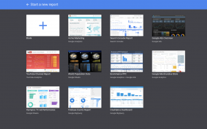
To get an idea of what’s possible through Data Studio there is a gallery that has a wide range of different styles and projects for you to peruse. In this blog, we’re just going to cover the basics, and how you might go about setting up a useful report to keep track of your business data.
There’s a selection of useful Google Data Studio templates available that cover a lot of what you’ll most likely be wanting to see (session data, Google Ads stats etc.), but in the meantime, we’re going to look at starting a report from scratch as it will put you in good stead to do you own thing.
Connecting Data Sources

Starting a blank report the first thing you’ll see will be a nice clean slate. Data Studio should have automatically entered Edit mode and will prompt you to add a data source. There are sample data sources to play around with that cover most of Google’s main platforms (Analytics, Search Console, Ads, Sheets), but we’re going to go ahead and ‘Create New Data Source’.
You’ll see a wide variety of Google products that you can connect with, as well as some partner connectors (many of which you’ll need to pay for). The main one to start off with is Google Analytics, so select that and select the Analytics account, property and view that you want to connect to the dashboard. Make sure to name your data source in the top left corner as otherwise things can get jumbled as you add additional sources! The next page will show the fields that you’re going to be able to access, and unless you already know you want to put together some custom dimensions, we’re going to go ahead and leave it as is. Clicking to connect the data source will link the dashboard to the source, and we’re ready to start putting together the dashboard.

Introducing Charts
Now that the data is ready to roll, we need to decide what the most important bits are, and then we can start visualising them.
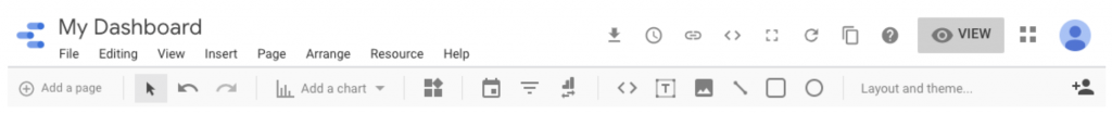
Looking at the interface below we have a lot of options, such as adding images, data pickers, and shapes – but to start with we’re going to go ahead and select ‘Add a chart’. For me, the most important thing I want to see is the number of sessions we’ve seen on the site each day so far this month, so I’m going to select the Time Series chart.
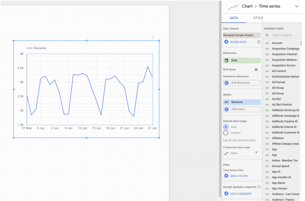
By default it has produced a sessions-over-time chart, and has automatically set the date range at ‘Last 28 days’ – we can add a Date Picker later that will default each chart with the date range set to Auto to a specific range.
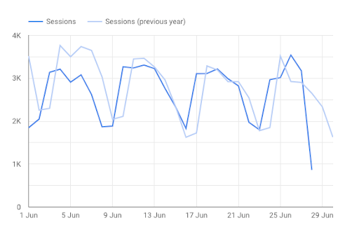
For now though, we’re going to change the date range to custom and select ‘This Month’. I’d like to compare the sessions we’ve seen this June to the sessions we saw in June of last year, which is going to need us to select ‘Last Year’ under the Comparison Date Range picker. Once you’ve done that, it should look something like this:
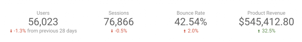
Another main way of displaying data that you’re going to want to be using is Scorecards, which simply display data (and allows for a comparison). Adding in a few simple scorecards for key metrics and setting the comparison date range to ‘Previous Period’ (more on date ranges in a second!) gives us the result below, which is useful for showing a performance overview:
There’s a large array of charts and table styles to choose from, so play around and find the visualisations that best suit what you’re looking for.
Date Ranges
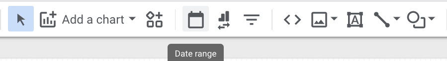
There’s a fair amount to play around with when it comes to date ranges in Data Studio as well. You can set an overall date range for your dashboard by adding a date picker element to the report:
This will then give you a range of options to choose from as the default date range for your picker. In view mode, users interacting with the dashboard will be able to change this to their heart’s content, and once they’re done it will revert back to whichever range you decide to set as your default. This is different to individual charts for which you have selected a custom date, as those cannot be altered by viewers. If you want to select individual date ranges on a graph/chart-ly basis, this can be done in the chart data settings under ‘default date range’ and changing from Auto to Custom.
You can select from a variety of both static and rolling date ranges; for example if you wanted to summarise for Jan-Dec 2019 this could be set as a static range, or if you were more keen to use the dashboard to track recent performance you could set it to a rolling date range of ‘last 3 months’. This then gives you the option to either include or exclude the current day, and updates on a rolling basis.
If you’ve got a multi-page dashboard you can maintain this same date picker over all pages by right clicking and selecting ‘Make report level, as you can with any other element. This will keep the same date range over all elements in your report’s pages – excluding any charts with custom date ranges.
As I’ve touched on in the previous section – you can also show date comparisons with an individual chart or scorecard, e.g. if you wanted to show month-on-month change or compare year-on-year performance on a monthly basis. When setting this you should see a drop-down list with a subheading ‘comparison date range’, that will be defaulted to “None” – but clicking it will open a calendar for you to choose specific dates or a rolling range to compare with the main data. A common rolling range would be ‘compare to previous period’, which will automatically update the comparison range if you were to alter the date range of your main data.
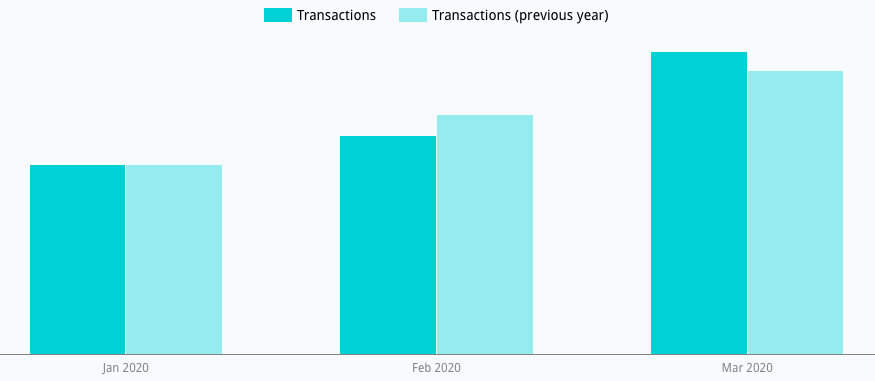
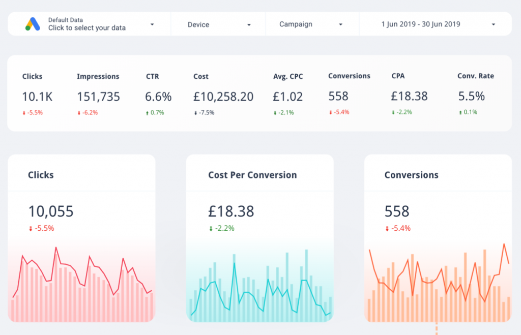
Above you can see a nice bar graph in which transactions for the first three months of 2020 have been shown with a comparison date range set as ‘previous year’, to look at performance in comparison to the same three months in 2019. Examples of this comparison in action for scorecards are shown in the dashboard below, where all eight of the top line data scorecards have been set with ‘previous period’ as a comparison range – and so you are able to see how performance has changed month-on-month for each of these individual metrics.
Constructing the Dashboard
There is a huge number of metric and dimension combinations that you can visualise within Data Studio, so one of the most important parts of building your dashboard is identifying which are going to be the most useful to your business. It’s all well and good knowing the bounce rate by hour of day, but if it doesn’t add any particularly relevant insight or help with strategy in any way then it’s probably best to leave it out.
Most templates and examples you’ll find have a summary page that starts with a row of main KPIs at the top, and a deeper dive into specifics over time etc. later on – this is a good baseline to start your dashboard with.
Data Studio allows you to have multiple pages within your Dashboard, so you can split out your data by category and spread them across pages; this works especially well if you are managing multiple domains/franchises and want to see custom-specific dashboards for each of them.

Getting Serious – Filters, Custom Metrics, and Google Sheets
With the basics done, you might be wondering how to dive a bit deeper into your data.
One of the ways to do this is through filters and segmentation. Data Studio allows you to import custom Analytics segments straight in and use them on a chart-by-chart basis, in addition to a selection of default segments. Filters can be created within the Data Studio interface and can be used to include or exclude data based on specific rules:
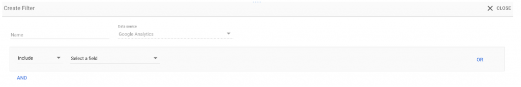
Again, these can be used on individual charts. You can create them by selecting a chart and selecting the ‘Add a filter’ button, or by going to ‘Manage Filters’ under the Resource section of the taskbar.
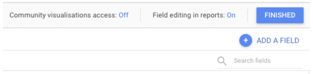
Custom metrics are another useful Data Studio capability. You can create calculated fields within the platform that you can then use for tables and charts. To do this, go to ‘Resource’ in the main taskbar and select ‘Manage Added Data Sources’. Then select Edit on the source from which you want to create a custom field. In the top right corner, hit the Add A Field button.
Here, I’m going to make a custom channel grouping, to segment my Google Ads campaigns out dependent on whether their names contain Lemons, Oranges, or Strawberries.
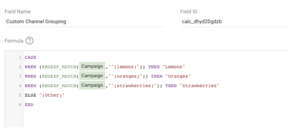
Now if I create a table using the Custom Channel Grouping dimension, my data will be split between these three categories. Being able to create custom dimensions and metrics is a very handy ability and is another way to make sure your reporting is tailored to be as useful to your business as possible.
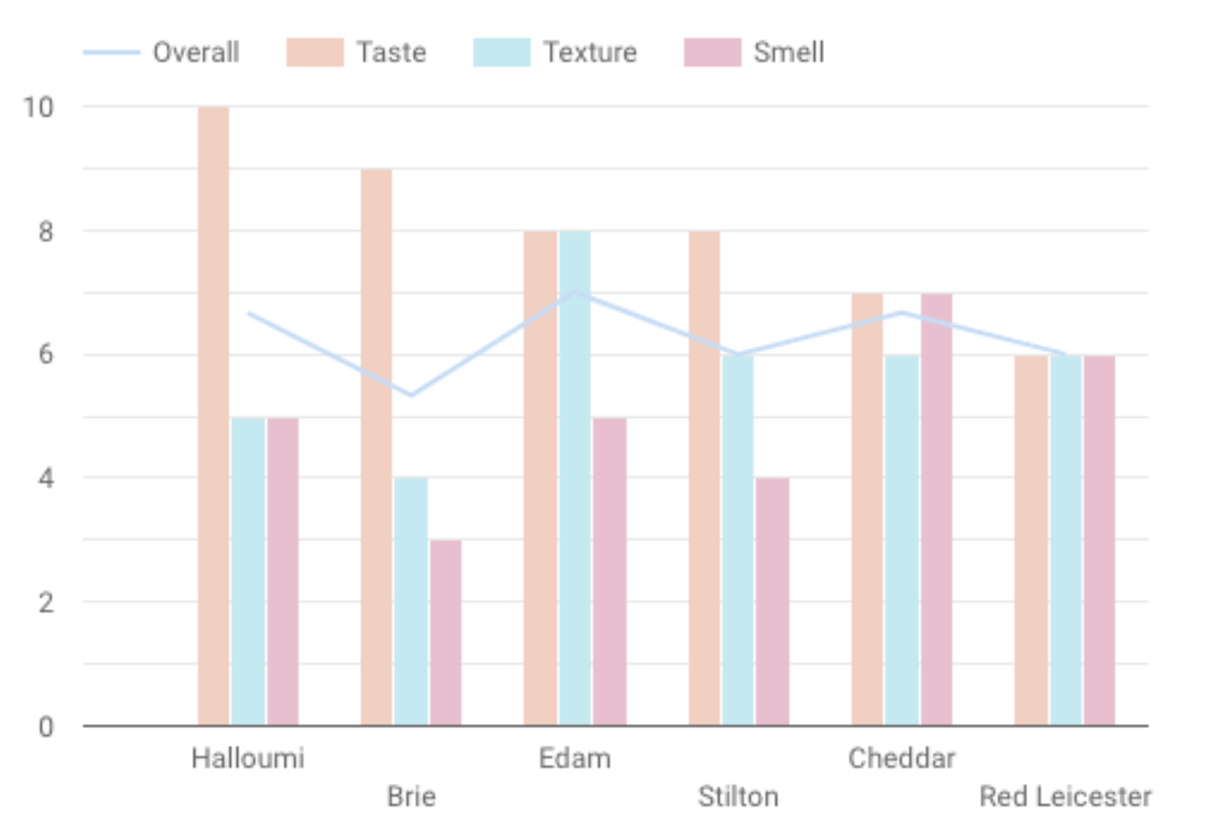
Now, what if you want to visualise data that hasn’t come through Google Analytics, Google Ads, or a similar platform? Well, have no fear, because Data Studio integrates directly with Google Sheets, meaning you can add in anything you like. For example, I’ve made a Sheet displaying my favourite cheeses; each has various ratings for its flavour, texture, and smell, as well as an overall rating.
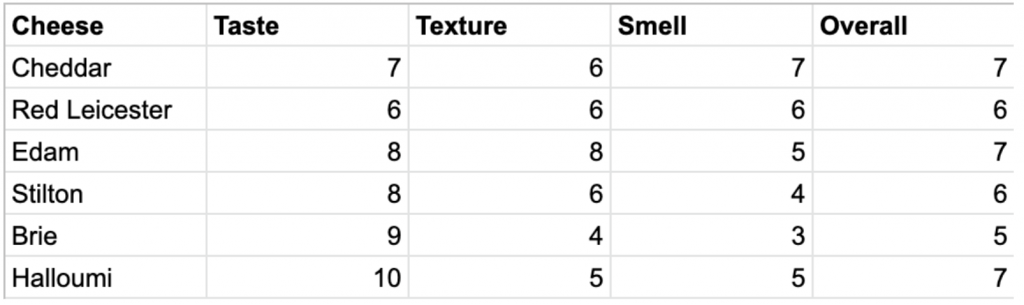
By selecting this sheet as a data source, I can display all of these as some very swanky charts. I’ve gone for a combo chart showing the overall rating as a line and bars for each attribute contributing to it.
The built-in integrations for different platforms make it easy to get data into Data Studio and start making the most of it!
Common Issues
Matching up metrics and dimensions doesn’t always go to plan. If you find yourself seeing this a lot, then something’s not quite right:
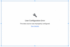
Common reasons for this error:
- You’re trying to combine metrics and dimensions that do not have a relationship. For example, if you try and visualize the ‘Phone Cost’ metric against the ‘Segment Conversion Type Name’ dimension, you’ll see this – because these two variables don’t have any way to match up.
- There’s an incompatible filter/segment on the chart. This happens a fair bit if you’re doing a lot of copy/pasting of charts that have specific filters or segments tailored to the dimensions and metrics of the particular chart. Try removing all filters and segments from the chart and see if it helps.
Another common error is the good old system error – this one is usually more straightforward to fix.
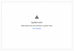
Common reasons for this error:
- Your data source is missing or inaccessible. Check that you still have access to the source and that it is sitting nicely in your data sources list.
- Internet connection issues – if you’re offline but are trying to load the dashboard if may throw this up.
- Glitches. Data Studio isn’t perfect and occasionally can glitch out. In this case, it’s best to just keep refreshing and tweaking until it sorts itself out.
Data Studio Basics – Top Tips
- Prioritise useful data; make sure the most important figures take precedent and ignore anything that won’t lead to any greater insights.
- Make the most of the wide array of chart types available; there’s more to visualising data than just line graphs and scorecards. In the Data Studio gallery, there are some excellent examples of how to use various chart styles in interesting ways.
- Customize your dashboard; there’s no need to stick to the default colour scheme – add images and brand colours to make your dashboard visually stunning as well as analytically hot.
We’ve launched our very own custom Google Data Studio report, grab yourself the dashboard here.
Want to know more about Data Studio? Send us a message or leave a comment below and we’ll be sure to get in touch.