

Putting a landing page together is easier than ever with drag-and-drop landing page builder tools like Unbounce.
Although the accessibility has increased for being able to create landing pages. This doesn’t mean they’ll actually be created using all the methods/best practices to maximise and increase their conversion rate opportunities. So how exactly can you maximise the likelihood of your landing pages performing well?
Try out our landing page checklist right here!
Wix – 21/24
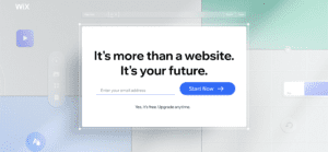
Direct, Short and Compelling Copy – This is a perfect example of how to do short and direct copy for headlines and body text. It Invokes emotion and reinforces the importance of the product – “It’s more than a website, it’s your future”.
Typeform – 19/24

Understandable Platform Showcase – Below the hero there’s a simple interactive showcase of the service: creating no-code required landing pages with ease. This showcase guides the user through an optimised journey, where it explains exactly what a typeform is and shows you visually how it works when creating a typeform page.
VidYard – 15/24
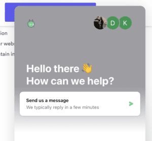
Chatbot Interaction – The advantage of using a chatbot is that they’re available 24/7, unlike us humans. They’re a great way to increase conversions if relevant to your landing page’s main conversion goal.
Talon – 20/24
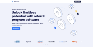
Strong Hero Structure – No navigation bar to distract the user, visual graphic isn’t overwhelming, content is direct and gets straight to the point. Further improving the hero is the positioning of the social proof logos, sitting just above the fold. Making it the first thing their users see without scrolling or searching.
Loom – 23/24
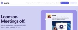
Powerful Headline – If you’ve ever needed a perfect example of how to make a headline powerful well here it is. As soon as you land on the page Loom immediately shouts at you “Loom On, Meetings Off”. This directly addresses a pain point and right below they back it up with a reassuring statistic “cut down meetings by 29%”.
AB testing.AI – 19/24
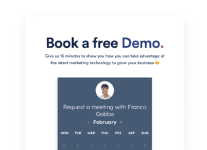
Inquiry Form Final CTA – Instead of clicking a button CTA or going to another page you can complete a simple calendar booking form integrated into the final section of the landing page. This is a clear way to finalise the user’s journey and allow them to convert without any confusion.
Airbnb – 17/24
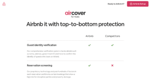
Speaking to Customer Pain Points – Airbnb has a user-friendly list section that clearly lays out exactly how they’ll solve your pain points. At the same time compare what they offer and what the other competitors simply do not. A perfect example on how to tailor copy so that it covers customer pain points while also showing how they’re better than competitors.
Unbounce – 19/24
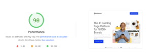
0-2 Second Loading Time – It’s incredibly important for landing pages to load extremely quickly to reduce user drop off leading to higher conversions. This Unbounce page loading speed is exactly what you should be after, achieving a score of 90 on this speed checker website.
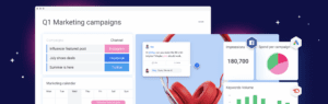
Shopify – 20/24
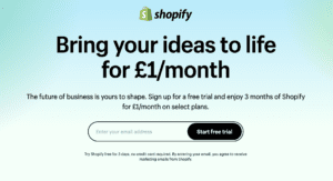
Follows the Principle of Unity – Shopify uses the best practice of ensuring all elements across their landing page are focused on explaining one concept effectively. By following the principle of unity, it is easier for the users to understand the conversion goal and therefore might very well increase the likelihood of conversion.
Hubspot – 14/24

Testimonials – Hubspot makes great use of including a testimonial on their page which is a great assurance to the user that you are legit and helps show them you are trustworthy. It’s good practice to include a photo next to the testimonial, especially photos where the person is happy as this conveys positive emotion towards the user.
Monday – 18/24
Compressed Imagery – Compressing your images is extremely important as it helps achieve the 0-2 second loading time rule. Using modern web-ready image formats such as Webp, JPEG2000 and SVG files where possible will of course help with this. Monday’s page has quite an amount of imagery but all of them have been compressed to help achieve that 0-2 second speedy loading time.
Vero Cloud – 20/24
Social Proof and USP Around Fold – Vero Cloud includes its social proof above the fold and right below the fold it shows its USPs. This is good practice for keeping all that important content/information right at the top of the page. As the lower, you go down the percentage of user drop-off increases so aim to include your USPs and social proof around the fold if possible.
Spidergap – 17/24
Sticky Bar CTA – This is such a strong technique to always have your main CTA visible to the user throughout their journey across the page. Not only that but you can include social proof like a small Trustpilot rating or other relevant content in there as well.
Learnupon – 17/24
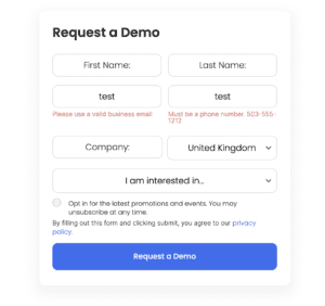
Clear Error Handling – Ensuring your form has clear error handling results in a more positive user experience. Let it be evident exactly what the user is submitting for and what to expect, ensure the form is clear and straightforward and by doing so there’s a much higher chance of a conversion.
Proteus – 19/24
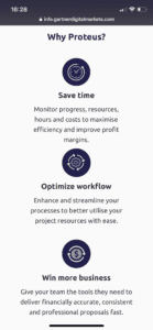
Mobile Content Stacked – How your landing pages are optimised for mobile is incredibly important. One of the biggest factors is stacking your content so it’s all visible and not hiding behind mobile-specific carousels. Stacking content like this reduces the chance they miss out on any crucial information that could lead them to convert.
Overall lots of great insight here across all of our findings from our top 15 landing pages of 2022! From the importance of social proof being high up on the page to the essential requirement of imagery being compressed to achieve crucial fast loading speeds.
One landing page stood out above all the rest and that was of course Loom with a score of 23/24. Let us know your favourite landing page from our list or any other pages we might have missed out on scoring for this year!