
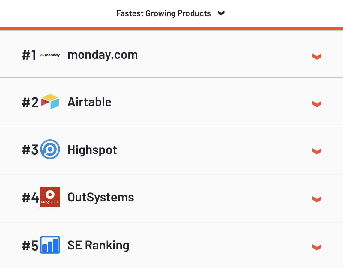
We recently analysed dozens of SaaS landing pages of the fastest growing products of 2019. This list from G2Crowd includes a number of names you’re bound to recognise, topped by monday.com.
In this article we explore what we found when analysing the landing pages that support the paid advertising efforts of these SaaS success stories.
All of these fast-growing SaaS companies have one major thing in common – they all understand the power of an effective landing page.
We’ve summarised our findings with some actionable steps that will have you topping the list in no time.
Judging a Landing Page by its Fold
If there’s one saying that we have drilled into us, it’s that we shouldn’t judge a book by its cover.
In other words, we shouldn’t rely solely on our first impression of something.
Subconsciously, we do this constantly. We also base a lot of different judgements on first impressions. Did you know, for example, that we generally make up our minds about a person we’ve just met after seven seconds.
Landing pages are often THE first interaction that people have with your product and brand.
That means your SaaS landing page has seven seconds to produce a positive opinion in your visitors. If you’ve ever used a session recording tool like HotJar you’ve probably been surprised by just how quickly users skim your pages.
Ultimately, a poor landing page can cause your users to bounce, and they might never come back.
A great landing page, however, can work wonders. It can convince your visitors to hand over their details, book a demo, maybe even buy your product right there and then.
Let’s dive into the best product landing pages from G2 Crowd’s Fastest Growing list…
1 – A Heroic Headline
Your headline can make or break your landing page. That’s not an exaggeration. The good news is that as far as landing page components go, your headline is the easiest element to change, test and iterate. With the potential to yield a 10%+ increase in conversion rate, it makes sense to take the time to get it right.
A boring headline and your visitors might immediately lose interest. A captivating headline and your visitors will be compelled to stick around to the end.
So, what exactly makes a compelling headline?
Choose a format that suits your product:
- Simply state the facts about what your product actually is. Consider this example from SE Ranking:
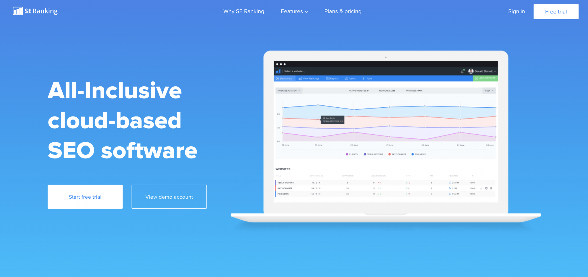
“All-Inclusive cloud-based SEO software” quite simply tells us everything we need to know.
- Another option is to focus on the customer’s use case, focusing on the pain point of the traffic you’re sending to the page. Check out this example from OutSystems:
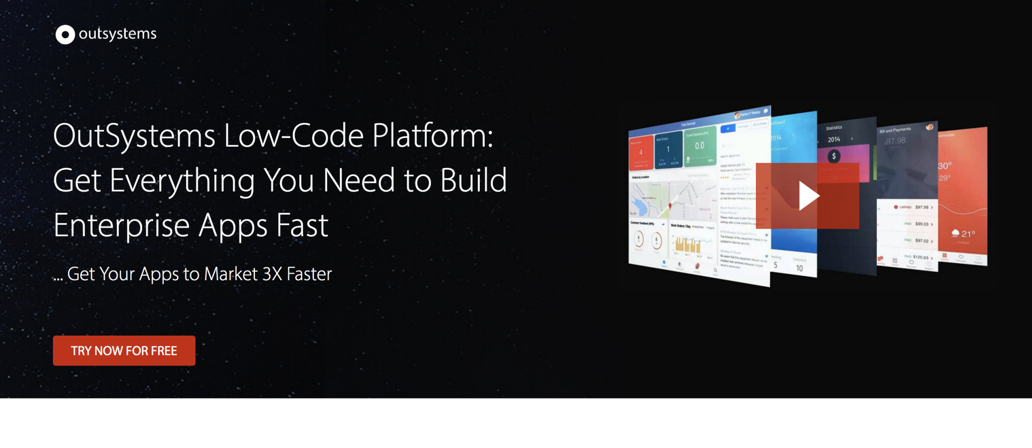
“Get everything you need to build enterprise apps fast” introduces the core functionality of the product & the key pain point — the need to be agile.
- Centre your message around the customer’s ambitions and goals. See this example from Airtable:
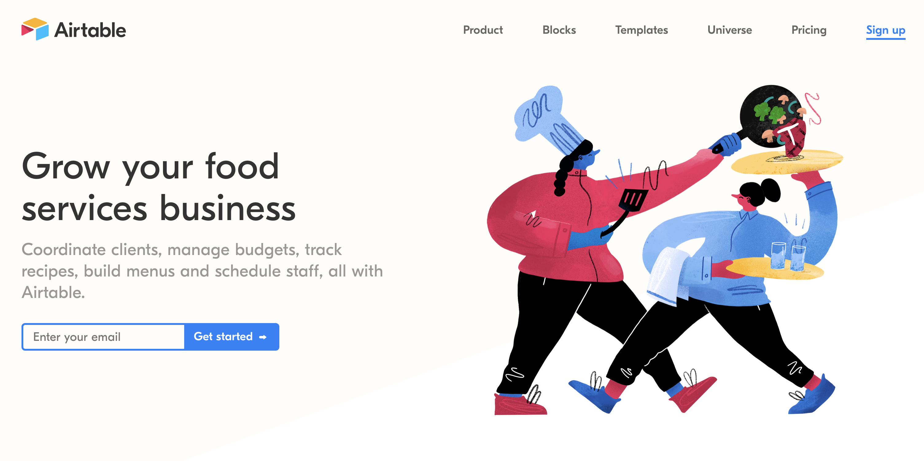
“Grow your food services business” doesn’t dwell on the moving parts of the product, rather drives straight to the heart of what the customer is aiming for, growth for their business. If you opt for this headline format, be unashamedly ambitious with your headline.
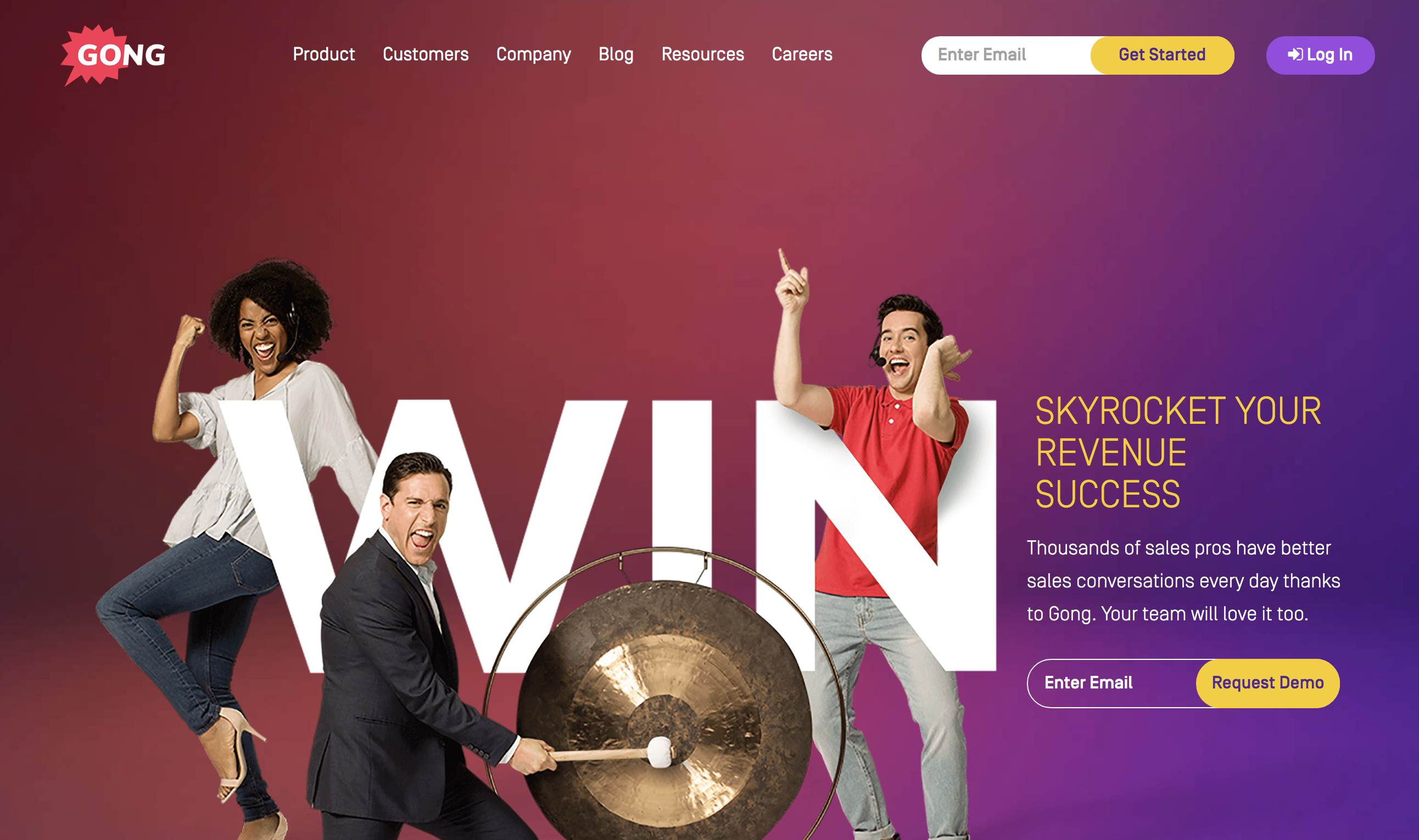
Gong shoot for the stars with their ambition based headline: “Skyrocket Your Revenue Success”
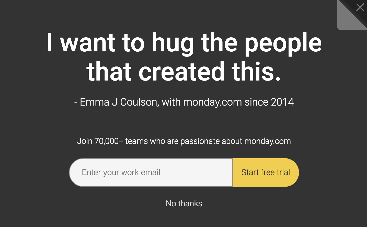
- Use customer testimonials – your customers say it best.
This headline example from Monday sits on an exit intent pop-up, but testimonials can make a powerful core landing page headline. Featuring testimonials front and centre also gives you a great opportunity to dovetail some additional relevant other proof.
Keep your headline short & punchy:
Another factor you should consider when it comes to writing your headline is the length. As a rule of thumb, aim for no more than 10 words. We’ve seen a trend this year for SaaS companies to opt for short but effective headlines.
Here are some of the best examples:
- Slack — Slack is where work happens
- Airtable — Spreadsheet, meet database
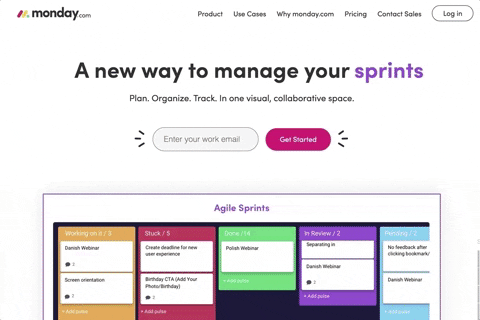
- Monday — A new way to manage your work
These ultra-concise headlines aren’t reserved for the poster-child SaaS products above, it’s all in the execution.
Check out the last example from Monday on their Google Ads Landing Page. By linking their main product image to a scrolling headline they’re able to convey multiple use cases / features and maximise use of the hero section.
Action Steps:
- Take the time to learn everything you can about your landing page visitors, this is crucial to crafting your headline
- Pick a headline format that suits both your product and what you know about your visitors
- Keep it succinct, no more than 10 words
- If appropriate speak directly to the visitor. Your brand, your business, your growth, your solution etc
2 – Show Me The Goods
The reason anybody is looking at your landing page is because they need a product. It goes without saying, therefore, that you need to show it off.
The easiest and clearest way to do this is with product screenshots or UI mockups.
Out of the 30 fastest growing companies on G2Crowd’s list, over two-thirds use images of their product on their landing pages.
Keep in mind, you don’t need to show off the whole product, that’s what your free trial or demo is for. You just need to convey the features & benefits.
2019’s SaaS leaders show simplified versions of the product so that visitors can see what it does without getting too hung up on every detail.
Your images need to demonstrate what your product can do. Your visitors are looking for any excuse to switch off, so they need to be instantly understandable.
There’s no use in showing a complicated dashboard if it’s going to take your visitors more than 10 seconds to understand it.
Highlight key sections of the UI.
- Slack utilise simplified UI mockups across all of their landing page designs:
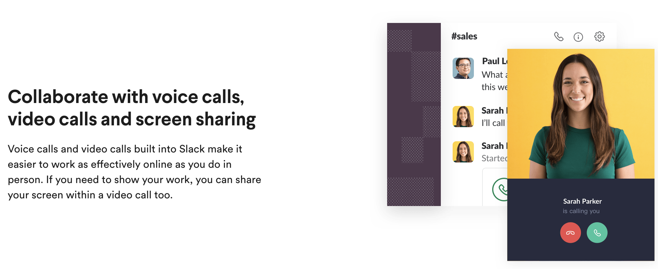
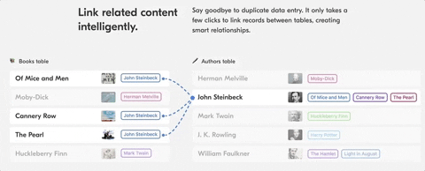
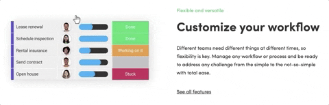
- Both Airtable & Monday have highlighted core functionality with simplified, animated UI mock-ups
So what exactly should you take away from this?
Take a look at the UI images you’re using on your landing pages, is it crystal clear exactly what functionality you’re displaying? If not, could your images be simplified or would some accompanying text help convey the USPs.
Action Steps:
- Use simplified UI mock ups, not fully fledged screenshots, to focus in on key features
- Utilise subtle animation to show more of what your product has to offer and grab attention
- Pair your images with relevant headlines and explanatory text
3 – Your Product’s Good? Prove It!
Adding third party validation to your landing page can give your SaaS product the authority that blowing your own trumpet simply won’t achieve.
All of the fastest growing SaaS product landing pages we looked at use social proof in one shape or another, it’s rare you’ll find a landing page dedicated to paid traffic that doesn’t.
Client logos – The more recognisable your client logos, the better.
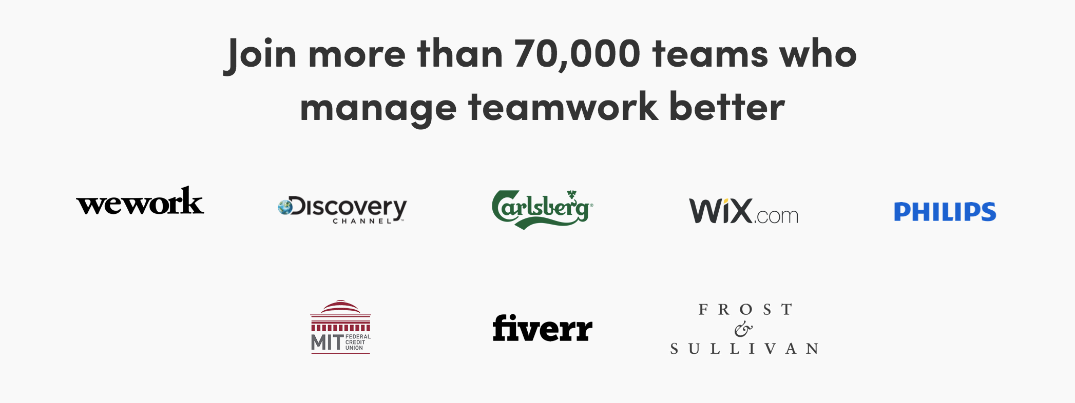
Not only do Monday show off some fantastic logos, but they also preface it by saying, “Join more than 70,000 teams…”, giving an indication of the scale of their user base. This number increased from 50,000 over the couple of weeks we’ve been analysing and researching these pages – they’re clearly doing something right!
Case studies – What better way to demonstrate the value your product has delivered than with detailed use cases showcasing stats, customer data and feedback.
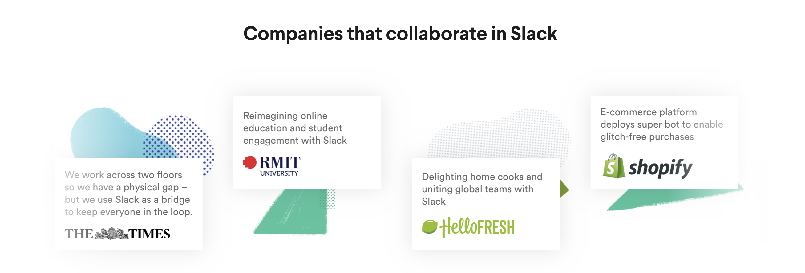
Clicking on any of those boxes takes you through to the full case study, so you can learn more about how other companies use Slack successfully.
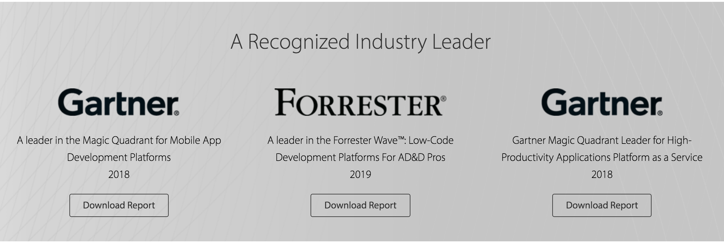
Awards / rankings – Zoho provide a slightly different form of social proof, focusing on ratings on industry review platforms. Zoho proudly display the badge that formed the basis of this blog, G2’s Top 50, alongside other credible industry badges.
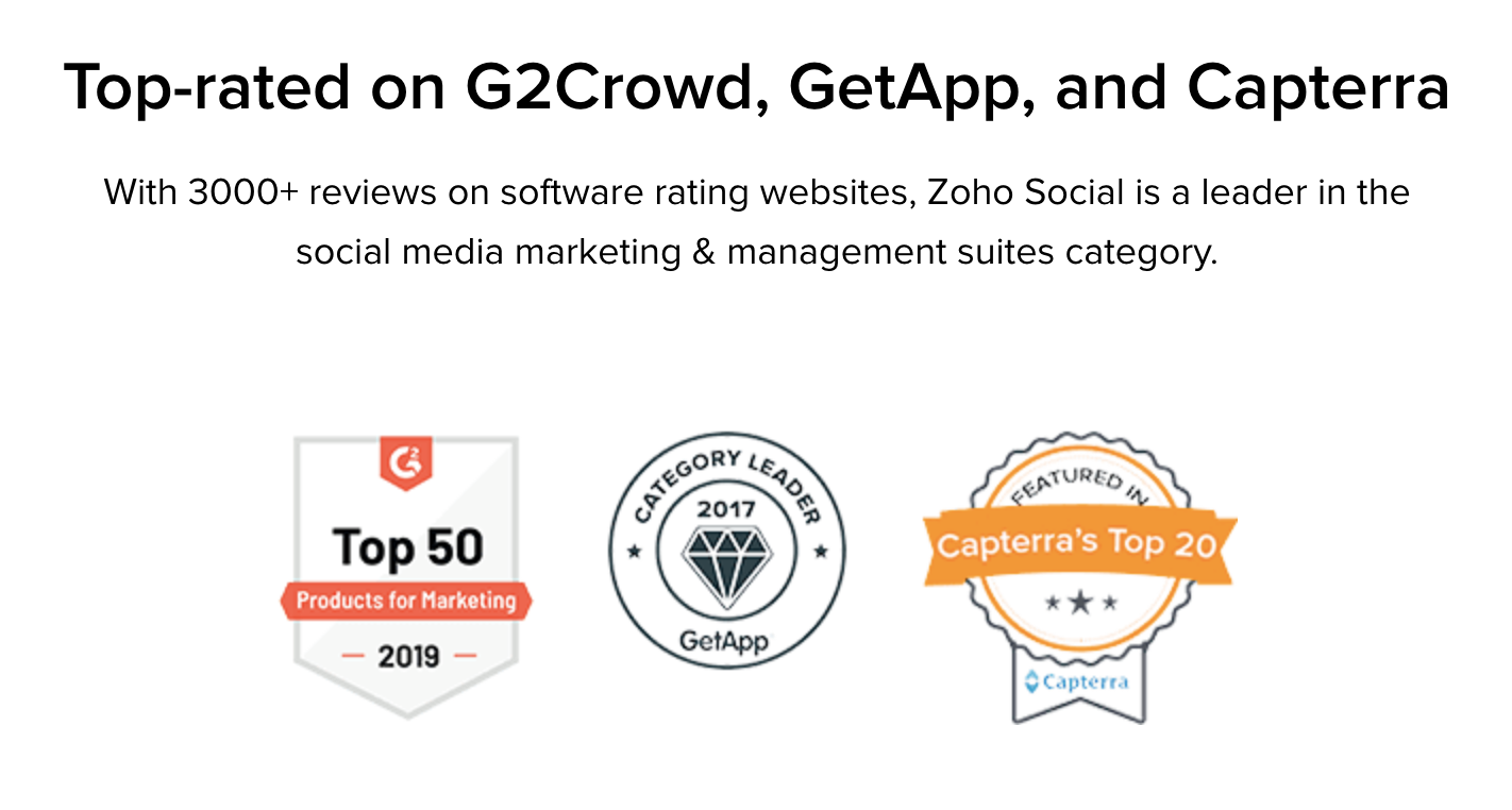
A seal of approval from the likes of G2 and Capterra is instantly recognisable to the SaaS connoisseur and adds credibility to your product. This is particularly powerful for enterprise / high ticket SaaS products. The decision makers you’re looking to impress are likely comparing tools on the sites mentioned above.
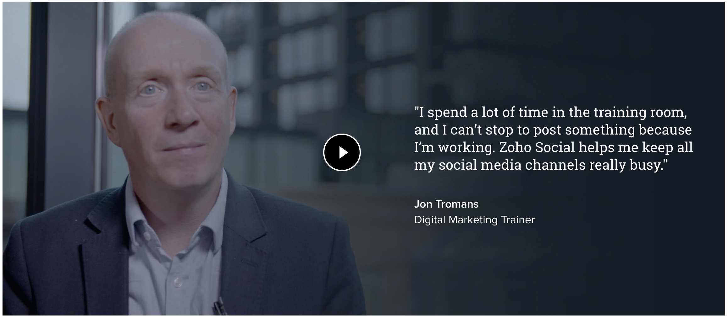
Video testimonials – Zoho Social & Monday recognise that video is far more believable than text, and it means visitors can witness first-hand the effect that their product has had on their customers. Users have the option of reading the except of the testimonial or watching the video for more detail. Giving users the option of how they prefer to consume content on your landing page is always a good idea.
Industry reports – OutSystems shine their spotlight on the industry reports they’ve accumulated from Forrester & Gartner. Much like showing awards, linking to industry reports is a great way of showing your product means business, and establishes you as an industry leader.
Action Steps:
- Gather your most impactful social proof and display it proudly above or just below the fold.
- Prioritise ordering the social proof on your page based on how well it will with your landing page visitors.
- Include faces on your testimonials, people buy people! Customer testimonials humanise your page.
4 – Is Your Product Inte-great?
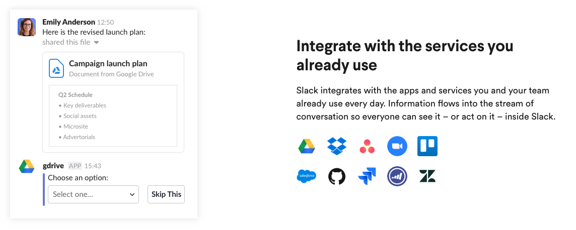
Customers expect your product to slot effortlessly into their existing workflow and tech stack. If your product doesn’t integrate with CRMs, marketing tools, messaging platforms, social media, the list goes on – it’s likely your customers are asking the question.
Out of the 30 fastest growing companies on G2Crowd’s list, four out of five reference integrations.
A report by Jackie Rebrovic of Cloud Elements found that offering pre-built integrations helped SaaS products reduce churn rate by 60% and increase customer lifetime value by 15%. Now, I’m not here to tell you how to build your product, but integrations are an important component of high performing SAAS landing pages.
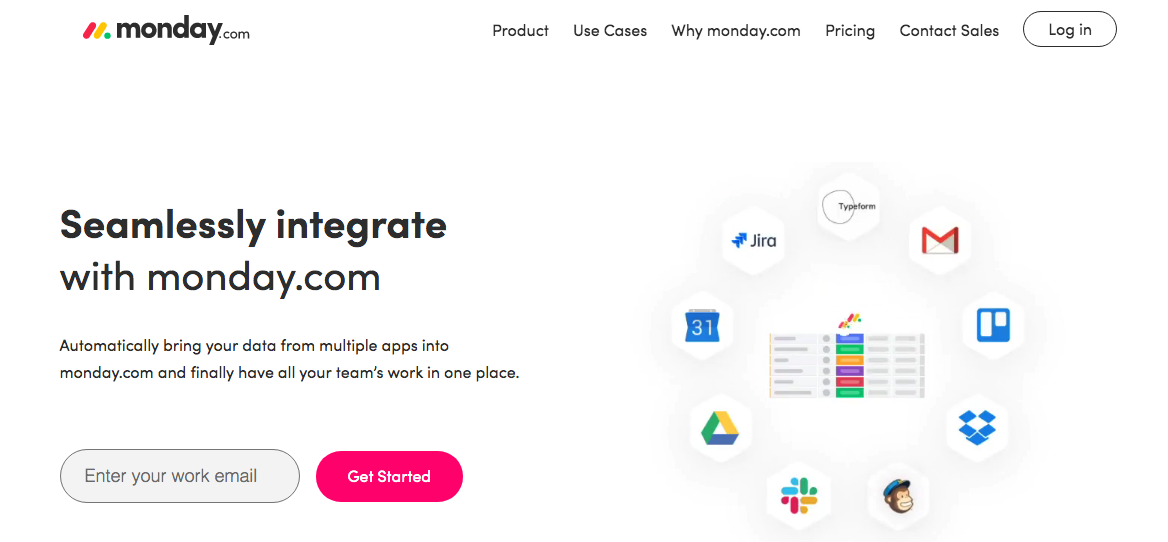
So much so that Monday have a Google Ads landing page dedicated entirely to showcasing their integrations:
5 – You Talkin’ To Me?
For this example, we’re going to return to Airtable.
Airtable, “Spreadsheet, meet Database”, has a wide range of industry specific uses. Through scouring the websites sitemap and Google search results we were able to find their industry specific landing pages. And, well, they really went all out.
There’s this one aimed at esports, and this one aimed at food services, the list goes on:
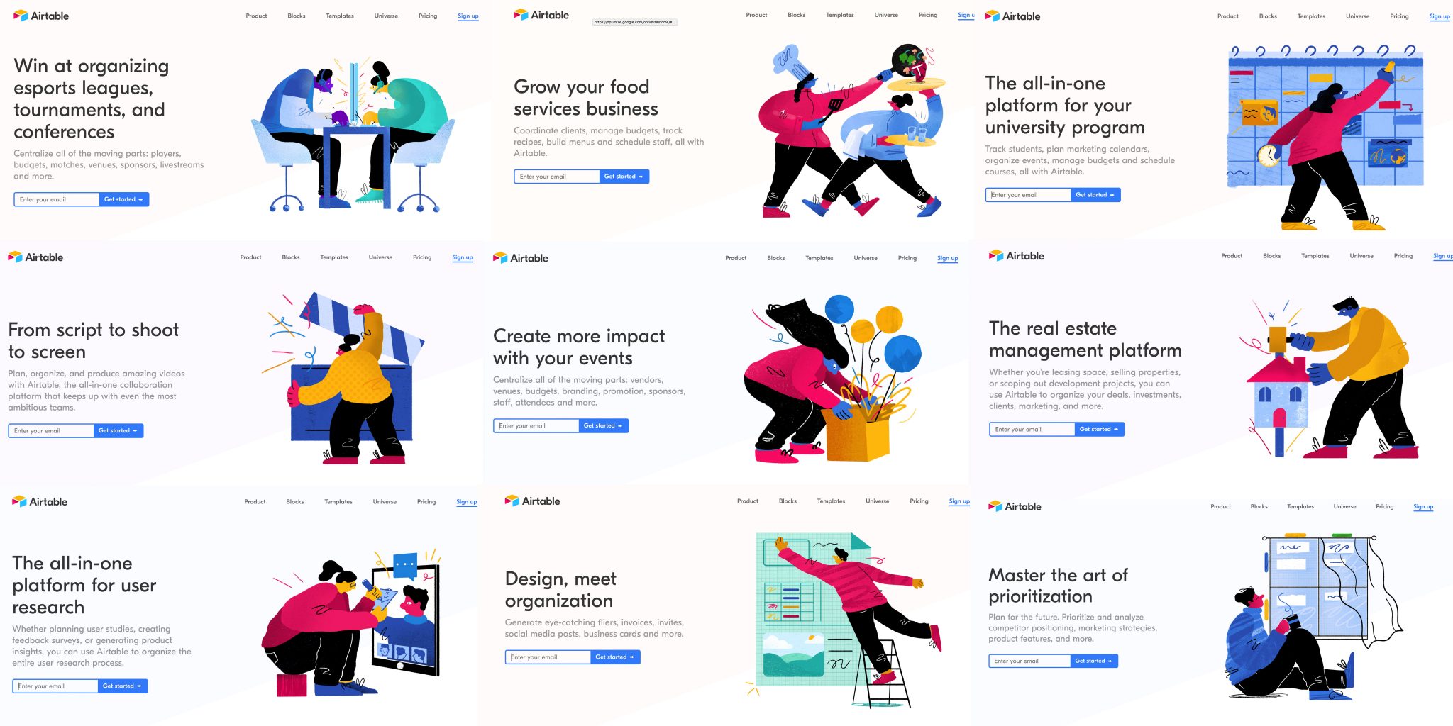
Behind Airtable’s industry and use case specific campaigns are a whole host of tailored landing pages. This level of personalisation has a profound effect on conversion rate.
We use Unbounce’s landing page creator. It’s our go to landing page tool due to the ease of drag and drop editing combined with custom code flexibility. It enables you to easily create multiple landing pages, tailored to each use case and you can duplicate core pages with a click.
Another method for making your landing pages more personalised without needed to create standalone pages, is to use dynamic keyword insertion. Unbounce has this functionality built in but you can dynamically change headlines and other page elements within any platform using Google Optimize DKI.
Look at this example from Monday, G2’s fastest growing SaaS product of 2019:
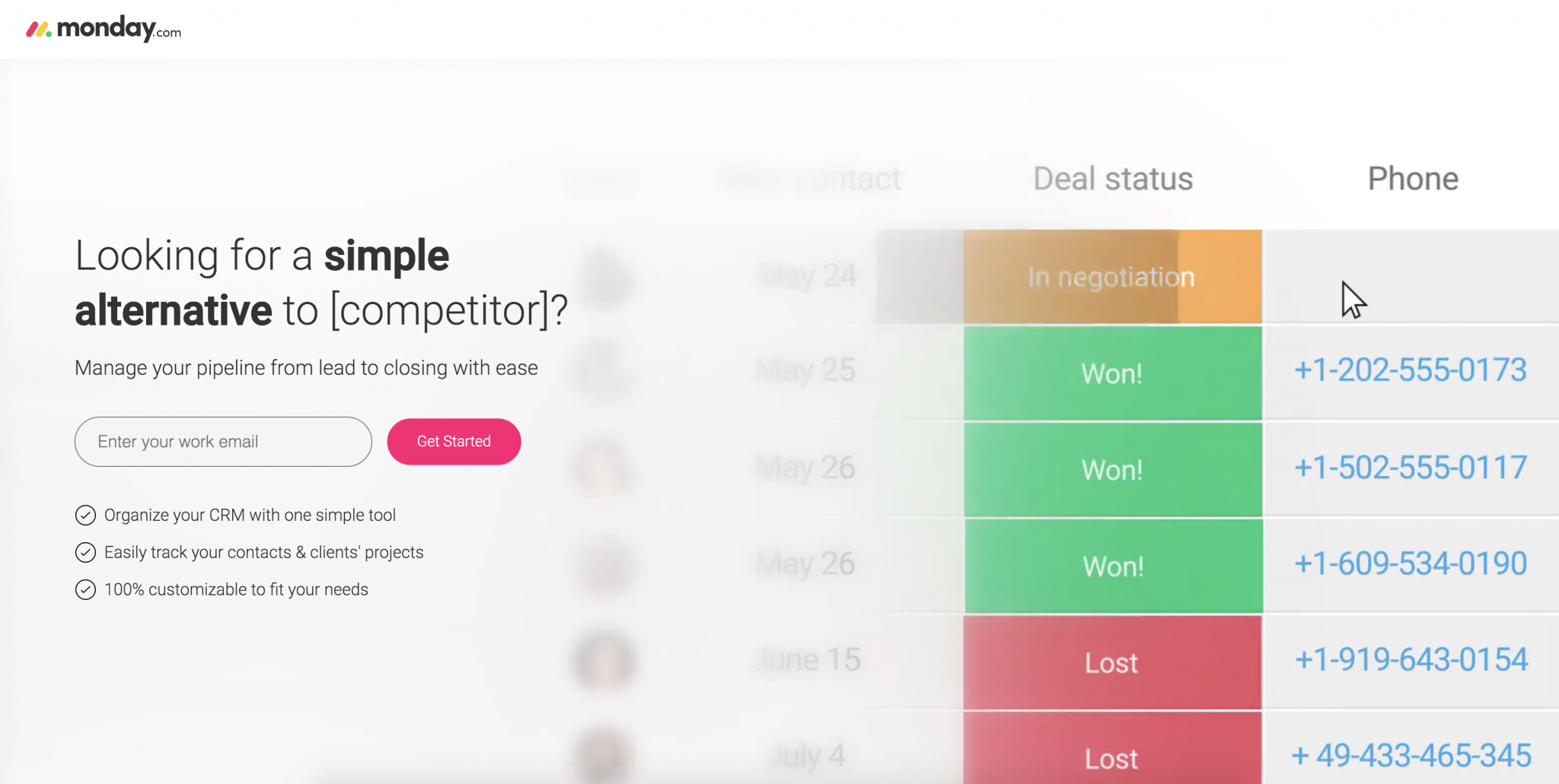
Dynamic keyword insertion allows Monday to make competitor specific pages at scale with simple changes to URL parameters.
Action Steps:
- Consider whether it makes sense to create specific versions of your landing pages.
- If your landing pages get significant volume or you’re running industry specific campaigns, build out tailored variations and test.
- If your traffic volume is low it might make more sense to utilise Dynamic Keyword Insertion and keep your tests consolidated.
- Analyse any first-party data you might have and generate some ideas. Take a look at search terms reports from Google Ads, industry data from your LinkedIn ads or Insight tag, and site search results from Google Analytics.
6 – Look, There’s A Distraction!
You might not realise it yourself, but when you look at a landing page, your eyes flit about all over the place. These micro-movements are what help you take in the information from the page. That’s why your CTAs should always stand out visually, so that visitors don’t miss them when they scan the page.
That’s also why it’s important to have a low attention ratio. As explained by Unbounce’s Oli Gardner, attention ratio is:
The ratio of links on a landing page to the number of campaign conversion goals.
On an ideal landing page, your attention ratio should be 1:1. In other words, you should have one goal (eg. to have visitors sign up for a trial).
In other words, you need to minimise any other links or CTAs. This puts the focus on what you want your visitors to do.
Let’s jump back to Monday’s Google Ads competitor landing page as a great example of this:
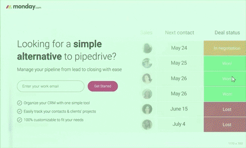
This competitor page from Monday is laser focussed – what you see above is the page in its entirety, no scrolling necessary.
The beauty of this single fold page, beyond its crystal clear outcome, is the ease and agility with which Monday can test this page.
With fewer variables at play tests on copy, CTA and video variations will reach significance much faster.
A common solution to achieving a 1:1 attention ratio is to remove page navigation all together. If you go down this path, make sure that your logo links to your home page or relevant product page on your main website. Web-savvy users will expect this behaviour and will use it when they want to learn more about your product.
To ensure user attention never falters from your core CTA, make it the most prominent aspect of your page. A great way to test the prominence of your CTA buttons and their text is using a Contrast Ratio calculator. By inputting your button and background hex colours the tool will report your contrast ratio based on W3C recommendations.
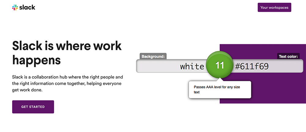
Aiming for a contrast ratio of at least 7:1 and higher will ensure you pass W3C’s AAA rating and put data behind the prominence of your CTAs. Slack score a solid 11 for their purple on white colour combo.
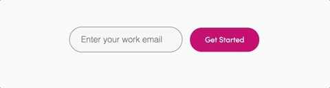
Monday take this one step further by pointing to and animating the first step of the conversion process.
Action Steps:
- Wherever possible, keep your attention ratio to 1:1. One landing page, one clear outcome.
- Make your CTAs stand out by using highly contrasting colours. This calculator will help you find the best contrast that is in keeping with your brand colours.
- Consider removing your nav bar entirely to focus your visitors’ attention.
Conclusions
Having spent quality time admiring, trialling and in one instance buying a tool on the list, we’ve come to appreciate just how well executed the landing pages behind the paid search and social campaigns of these SaaS products are.
Remember, building a great landing page starts with a deep understanding of your audience, both current and prospective.
If you’re running highly segmented campaigns, this might be apparent in the nature of the targeting. If you have landing pages with a mix of traffic, from generic search keywords for example, take the time to learn everything you can about these visitors before you dive into tweaking and testing.
You can dig through the pages in more detail on Pinterest:
I’d love to know your thoughts on the article and hear which landing pages have left a lasting impression on you this year. Leave a comment below and let’s kick off a discussion!