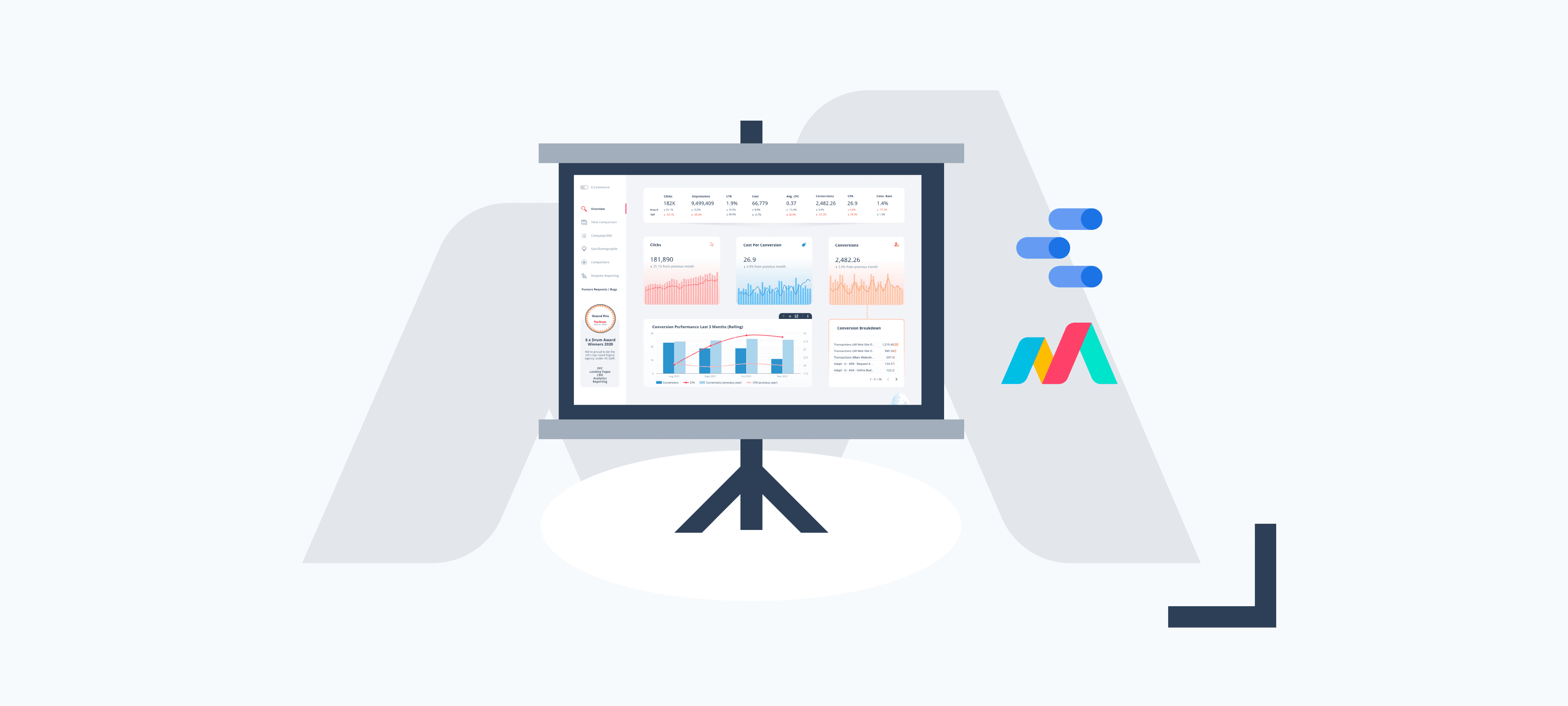

We love Google Data Studio here at Bind Media, it truly is one of the most versatile data visualisation tools at a marketers disposal.
Best of all, it’s completely free!
With this latest foray into “what’s possible in Data Studio”, we wanted to really push the boundaries.
How to get the Google Data Studio Dashboard free
We had an overwhelming initial response and with over 6,000+ early birds using the dashboard across 72 countries. It includes:
- Toggle between Lead Gen & E-commerce reports
- Campaign, Ad Group & Keyword performance
- Quality Score reporting
- Conversion breakdown
- Flexible date ranges, drill-downs & YoY performance
- Competitor insights
- Geo & Demographics performance
Add your details below to view the dashboard (full copyable version)!
Video Run Through
If you’re a visual kind of data visualiser, we’ve put together a video that runs through the report page by page and dives into some of the more useful (and often hidden away) features.
Let’s Jump In – Report Structure
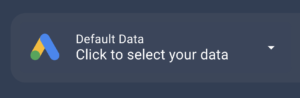
Data Selector
First things first, you’re going to need to select your Google Ads accounts using the data selector at the top left of the dashboard. If you see a Sign-In button, you’ll need to login to the relevant account and refresh the report. You can select multiple accounts but they will need to share a currency so the report can aggregate cost metrics.
Something we get asked a lot: “Is my data secure?”
Absolutely, your data is secured against your Google login, only you will be able to view and access it. Think of the report as a window through to your data.
Filters
Have a look at the filters that make up the dashboard’s header, alongside the data selector. By default we have campaign type, campaign, device and a date selector.
Once you set these filters they will remain in place across all pages during your time exploring the report. What’s even better is you can bookmark the page and all of these filters will be stored with the bookmark!
This is something our clients and dashboard early birds have found particularly useful – setting up multiple bookmarks to link straight to the page and filter combinations that show really meaningful data.

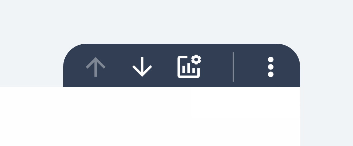
Google Data Studio Navigation
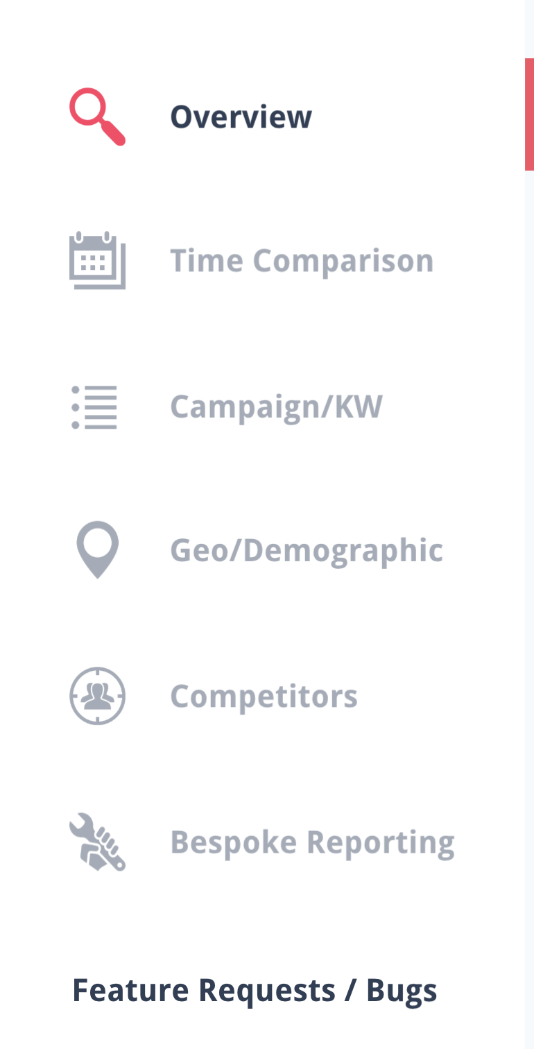
Deciding not to settle for Data Studio’s native navigation, we’ve baked this into the page itself. Not only does it look much better but it makes browsing through your data a breeze.
Last but by no means least, the pièce de résistance, an E-commerce toggle!
At the flick of a switch you can navigate between lead gen and e-commerce versions of the dashboard, with metrics and dimensions to support these campaign types.

We are extremely pleased with the end result!
We’ve had so much positive feedback and more confused messages around how we pulled elements off than I can count. We certainly achieved what we set out to, take Data Studio to the next level and build one of the most comprehensive Google Data Studio reports out there!
If you’d like to learn more of the “fundamentals” of Data Studio, we’ve put together a Beginners Guide to Google Data Studio.
Page One – Overview
Summary
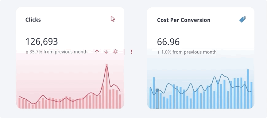
The overview page provides a snapshot of your Google Ads performance, leading with a scorecard section with comparisons for both previous period and previous year. Remember, utilise the filters in the dashboards header to display the data you’re most interested in.
We’ve included some core metrics in the three chart sections below this. There we have our first introduction to drill down dimensions:
Drill Down Dimensions
If you aren’t using drill down dimensions in your custom Data Studio reports, you’re missing out! Across the three time series graphs on the Overview Page you’re able to drill up to year and as far down as hour of day. Suddenly a few simple charts give you a plethora of data!
We’ve made it nice and obvious throughout the report where you have the option to explore greater depths of data via drill downs with these tabs:
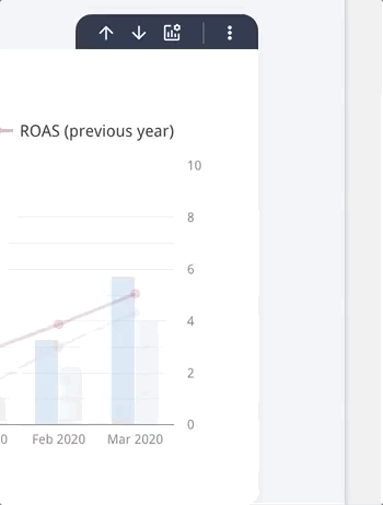
At the bottom of this page you will find a three month rolling conversion / revenue chart with a year on year comparison.
Finally, a conversion breakdown table. On the lead gen version of the report this will display a breakdown of your Google Ads conversion actions. For e-commerce you’ll see a concise revenue vs. campaign breakdown.
Page Two – Time Comparison
Summary
The time comparison page aims to provide much more detail around performance over time, by default the last 12 months. This page is made up of just two components, but, with the ability to drill down through the time dimensions and change the metrics displayed, these two components alone do plenty.
The headline chart shows core conversion metrics year on year, with the darker of both the bars and line representing this year. The drill down dimensions come into their own here, allowing you to hone in on performance changes for much more specific time periods than is displayed by default.
Optional Metrics
Wherever you see this icon ![]() you are able to change the metrics displayed on the chart or table. If what you’re looking to see isn’t on the chart by default, chances are it’s in here.
you are able to change the metrics displayed on the chart or table. If what you’re looking to see isn’t on the chart by default, chances are it’s in here.
Page Three – Campaign/Keyword
Summary
At it’s core the Campaign/KW page presents data based on the hierarchy of a Google Ads account. By now you should be very familiar with drill downs. The headline table on this page allows you to drill up to Account, particularly useful if you have multiple accounts selected, and down as far as quality score.
The Match Type and Quality Score summary charts aim to give you an overview of how your conversion metrics are spread across these dimensions. Keep in mind, the headline table above can provide a lot more detail on these dimensions via the drill downs. These charts typically serve as a visual aid for spotting trends you can explore in more detail elsewhere on this page.
Search Query “Mining”
This section of the report utilises a custom search filter that allows you to isolate specific search term performance.
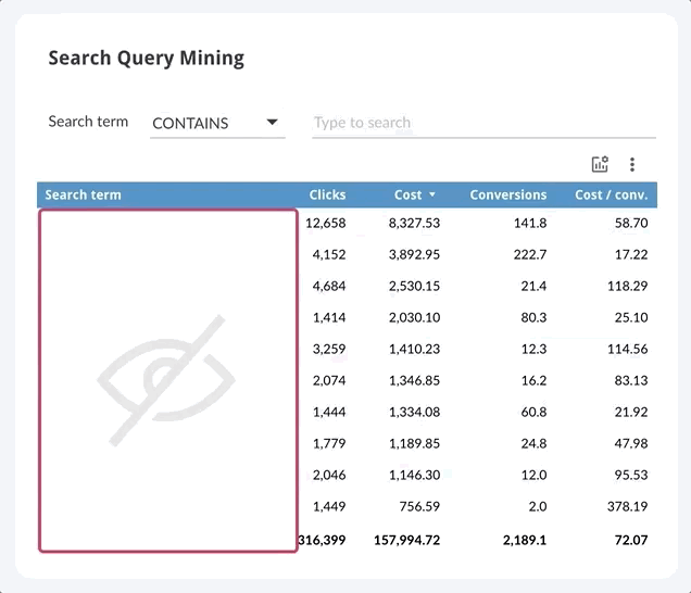
Whilst this filtered search term list can generate some very useful data, depending on your account size the list can be rather exhaustive. Fortunately you can download this data, and any of the previous tables and charts you’ve created for that matter, using the export option.
Page Four – Geo/Demographic
Summary
It’s time to get some more context on our audience, where and who they are. Our Geo/Demographic page has three default “zoom areas”, UK, EU and USA. Flicking between these will not only change the map that is displayed but also the location dimensions relevant to those areas. Selecting USA for example will provide State as a dimension.
Demographics
Now we know where our customers are, who are they? The final two components of this page aim to provide context of the demographic make up of your Google Ads account as well as diving into first and third party audience data.
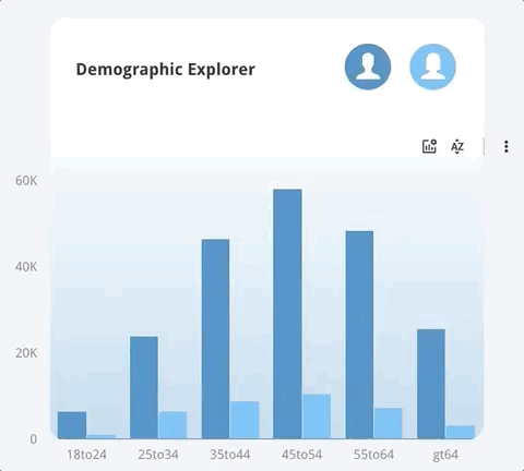
Our Demographic explorer plots the targetable age ranges with Google Ads vs. gender. Using the icons above you can opt to filter the data to display only males or females.
Trends spotted here can be used to inform your age and gender bids adjustments.
Audience Performance
The final section of this page provides performance data for your audience types and specific audiences within these categories. In the below example we can see the performance of our first party audiences, website data, and third party Google owned or generated audiences, In Market and Similar.
Drilling down within this table will display performance based on specific audiences. This is particularly useful for uncovering audiences that result in a higher return on investment to inform your bid adjustments.
Reminder, use the filters in the header to segment this audience data so that it more insightful. You might want to exclude brand or look at a specific subset of campaigns for example.
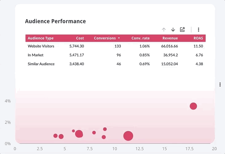
The bubble chart here is our way of visualising audience performance. Relevant conversion metrics will be plotted and the bubble size reflects conversion volume or revenue depending on the version of the report you’re on.
If you’re seeing an error in this section then it’s likely you don’t have audiences added to your Google Ads campaigns. Luckily we’ve written a guide on using Google Ads search audiences.
Hint, it’s a no brainer!
Page Five – Competitors
Summary
This final page of the report dives deeper into competitor trends over the last 6 months. You’ll see an overview of your domains performance, a summary of your top competitors and an analysis of your competitors impression share over time.
So for the last time – utilise the drill downs! The first chart can offer some great detail on your competitive share of the market over time – even going down as far as hour of day.
How are your ad schedule bid adjustments impacting your competitive edge? Are your competitors beating you on certain days of the week or certain times of the day? Herein lie your answers my friend.
That’s a Wrap 👍
Whether you’re a Data Studio aficionado or are just starting your visualisation journey, we hope this provided you with some useful Data Studio tips.
If so, please do share it with your network. Getting the word out helps us continue to make more resources like this!
If you have any general Data Studio questions or suggestions for the dashboard, reach out to our team and we’ll get back to you!
Happy dash-boarding!